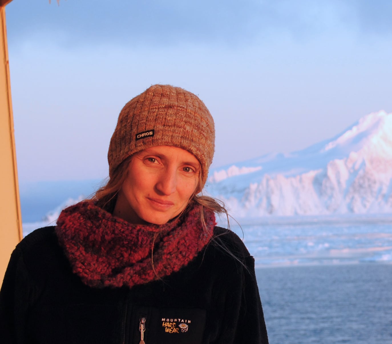
Skye Moret
Skye Moret believes in the power of visualization and meaningful engagement in bridging the gap between two traditionally polar disciplines: design and science. Her work investigates the complex relationship between humans, technology, and nature. Skye creates work that encourages curiosity, empathy, and interaction. She explores these themes through data-driven design and visual storytelling. She believes that the synergy of seemingly disparate disciplines will create the social-environmental engagement necessary for the proper care of our planet and each other.
Moret’s peer-reviewed articles in international journals primarily concern baseline, long-term marine plastic pollution research. They range from the geographic distribution of pollution in the open ocean, to debris’ physical and chemical properties, and how to actively engage with this current environmental issue in the classroom.
Living in Portland, Oregon, she is a Design Strategist and Data Visualizer at Periscopic and an Assistant Professor in the Collaborative Design + Design Systems MFA/MA program at the Pacific Northwest College of Art (PNCA).
By Jody Turner
Hello Skye! You are a wonder to listen to in your lecture classes but beyond the verbal science mind and adventure stories, you are a visual thinker as well! Great combination!
Can you tell us a little about your background and how your passion infuses your work today?
Yes! I have worked the past two years for Periscopic in Portland Oregon, helping nonprofits illuminate their work. The visualizations often help them understand their data better or allow their intended audience to understand its impact. I have to continually ask, ‘what potential does your data have? How robust is it?’ How can visualizing it help enlighten your work and your intention?’
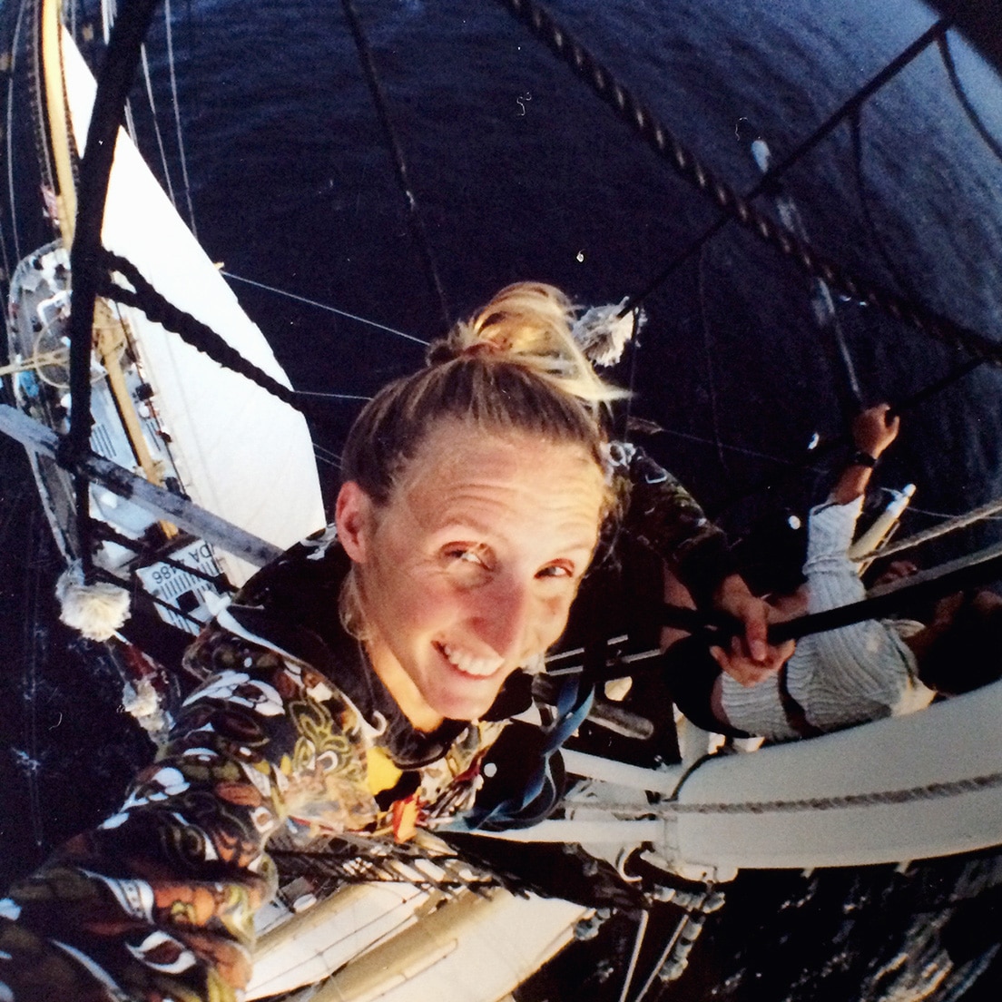
Skye Moret on the ocean teaching students through the Sea Education Association.
I spent a decade sailing more than 80,000 miles of open ocean, teaching undergraduates through the Sea Education Association. While educating about environmental issues, we were also teaching robust oceanography on these two tall, sexy 134-foot schooners. While engaging students, we were actively tracking the ‘big picture’ of what was going on in the ocean.
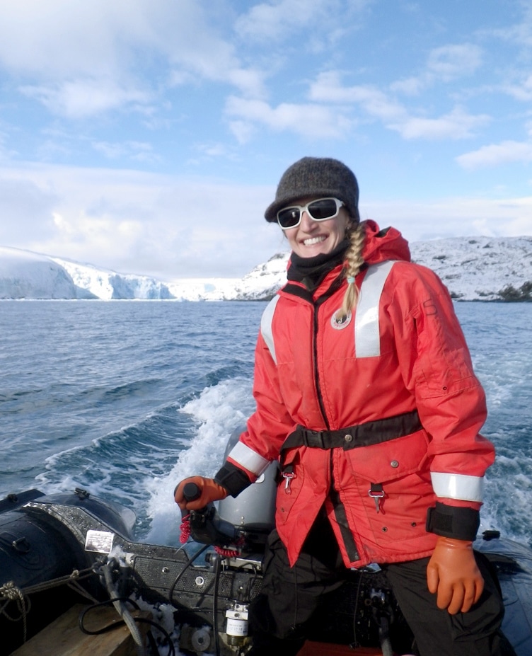
I also worked for the United States Antarctic Program (USAP) facilitating science onboard nine different interdisciplinary cruises that studied everything from marine ecology to the geology of the continent.
Throughout this time, I developed and worked on my passion project—I put together the world’s largest inventory of marine plastic pollution in the Atlantic and Pacific oceans, which had not been done before. In 2010, we published in Science Magazine, and have since published in several other high-profile science journals. These are the baseline foundational papers of much marine plastic pollution work that is going on today.
When did you begin expressing your scientific data through visual design?
A breaking point came in that work when, after volunteering my time hour-upon-hour for two years to put together, analyze, and write up these amazing ‘big picture’ datasets, people were not reading these science papers. It was not reaching citizens engaged in the problem of marine trash or who should be reading about such issues. Scientific language is too full of jargon and there is a significant paywall to access. I became disenchanted with the academic approach.
I began Googling ‘interdisciplinary communications’ and landed on several design programs. I applied and I was surprised that I got in everywhere. Initially I attended Art Center College of Design in Pasadena, California. For one year I studied within their Media Design program and I learned so much. I had to use a Mac and learn Adobe products so that it would be easier for me to communicate ideas visually. It was an introductory Information Design class, however, that showed me how data could still be my currency in the design realm.
I decided to transfer to Northeastern University’s new MFA program in Information Design and Visualization in Boston. It was the first of its kind. Since then, visual literacy has expanded. I am happy to see that there are more graduate programs blossoming in this field.
Skye at Deception Island, located in the South Shetland Islands above the Antarctic Peninsula.
What was your final thesis?
One of my fundamental questions is, ‘how do you meaningfully engage with nature?’ I combined the approaches of science and visual communications and applied them to this engagement within the context of Antarctica.
My thesis was entitled, ‘Constructing a Continent.’
I have a strong critique of typical design methods, they are often presumptuous—very top-down when creating design for ‘the public.’ So, I challenged this by handing out 250 cards to random people that simply asked: “When you hear the word Antarctica, what are you most curious about?” There was room for five answers on each card. I ultimately collected over 1,150 curiosities. This bottom-up approach, driven by participatory research, turned into five different Antarctic data visualization projects.
What is a project you feel succeeded for you on all fronts, science, adventure, engagement?
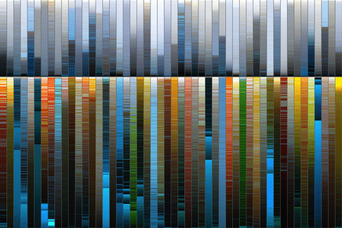
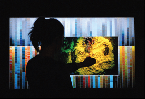
Each vertical bar sorts and samples the pixels in photographs taken on the Antarctic Peninsula. Fifty upper bars represent images captured on land and fifty below the sea.
My most involved project is: Antarctica: A Chromatic Paradox. I highlighted the juxtaposition between the grey, white, and blue colors from above the surface that we expect to see in Antarctica with the amazing, colorful environment below. It is an interactive, gestural piece—wave your hand over a bar full of colored pixels from an Antarctic photo and the image appears, illuminating the land-or seascape. With even a quick glance, it shows the rich contrast between the density and diversity of life above and underneath the waves. At a closer glance, each individual photo has its own story to tell polar life.
I would love to do this all over the globe, surprise and engage people by visualizing ecosystems in new and different ways.
I hear you were in Lebanon recently.
Yes, I was in Beirut, Lebanon, February 2018, for an incredible workshop called Data4Change. It is a 5-day workshop that brings together data scientists, designers, and developers from all over the world together with human rights organizations in the Middle East North Africa (MENA) region. The trouble with data in the MENA region is that people are collecting lots of important, robust data but there is often not the professional capital to analyze or communicate it in ways that can create impact. Data4Change brings these assets together to help human rights groups.
It was highly competitive. Twenty of us made it—about half from the Western world, and the other have from the MENA region. Four groups each formed around a different human rights group.
We worked with the Iraqi Human Rights Observatory about the half-a-million families still displaced in Iraq. Half of them are children, growing up with no stable home. We created a data-driven interactive and story-based website that tells the human story of displacement. In only five days we were able to create a beautiful, working prototype, and will be finished in the next few months as final Data4Change grant funding is distributed.
What are you up to today? Any new residency projects?
Today I am teaching and doing many side design projects. I always have to be learning and stay challenged, so I also look for and apply to art residencies where I can focus on further exploring data-driven environmental design work.
Previously I participated in LabVerde, an art-science immersion program in the Amazon. I studied and worked for 10 days, exploring the jungle on excursions and with scientific lectures. I investigated ecological thresholds through data-driven art experiments. I wanted to understand what really makes a place unique. Why do we value natural places in different ways? What information is entering our brain in these locations that creates these distinctions? Is it the smell, the humidity, taste, color, sound, the textures around us?
Recently I got into the Nature Art Habitat Residency in the Italian Alps, with a focus on water. Nature and water—my currency! I am super excited to be there in the month of June, 2018. I will ask similar questions about ecological thresholds but also ask: what is the future of water, how do we value water, interact with water? I will observe and then speculate on how this future and our values might shift as the climate changes.
Then, in the month of September, 2018, I will be in Iceland, exploring that environment in a similar way as part of the SÌM residency.
In just over a year I will have a more holistic data-driven design investigation comparing nature in the Amazon, the Italian Alps, and Iceland. I will come away with visual, empathetic experiments in which I can then engage people through designed media and stories.
Antarctic colors.
I am also thrilled that, at the same time as these last two residencies, my Antarctic colors piece will show at the ‘Life at the Edges’ exhibit at Science Gallery, Dublin for three months. Thousands of visitors will get to interact with the marine environment in a place they will likely never get to see in real life. It is my hope to continue doing projects that inspire a sense of awe and responsibility about the natural wonders of our planet.
The book Living in the Creative Zone, Transforming the World One Idea at a Time is a collection of interviews with international figures driving innovation and change forward through their day-to-day work. For the next year these interviews will publish on the impactmania platform, the complete e-book will be available upcoming.